Stop violence

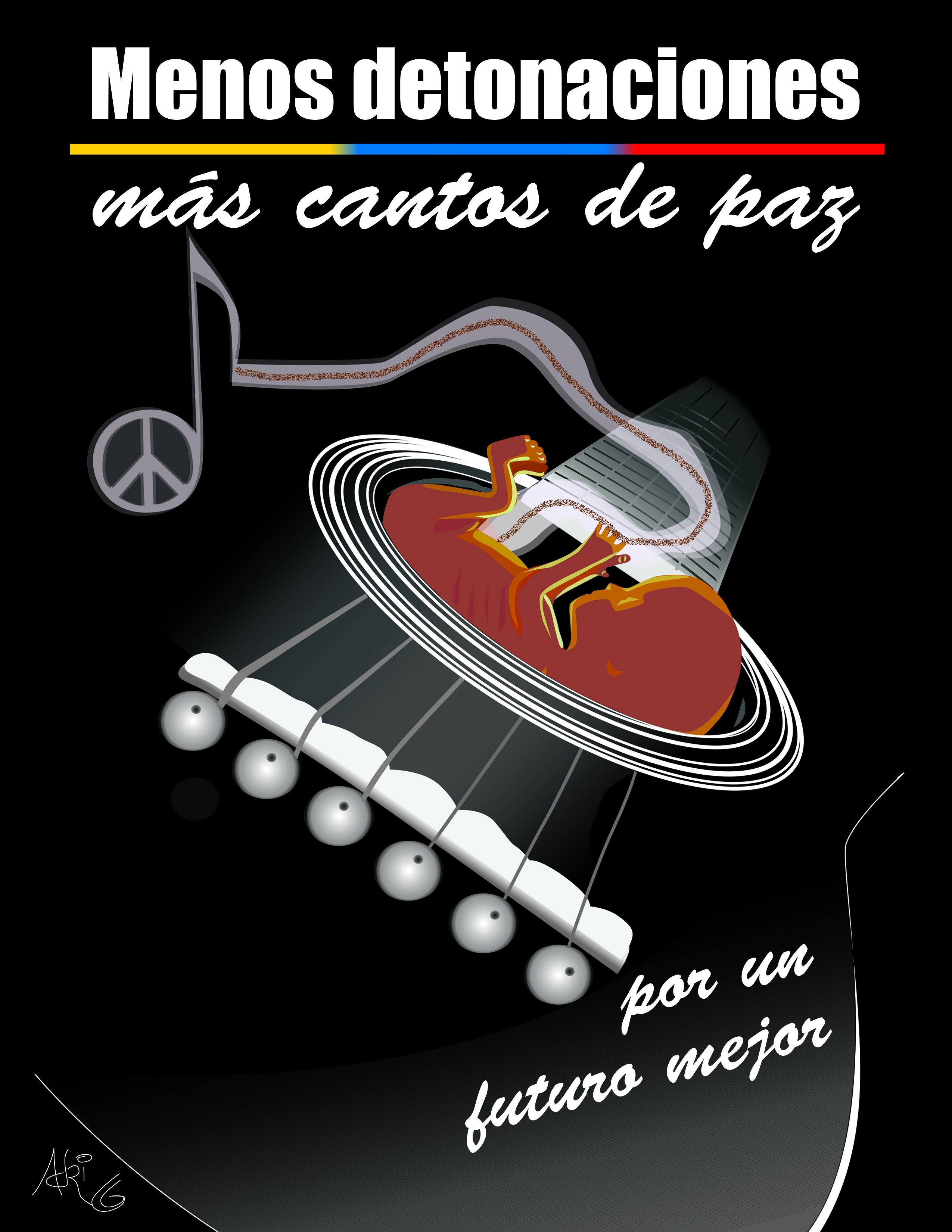
This is a little something I made thinking of all the violence that’s affecting my country. It goes on the same line of the contest I won almost two years ago and it’s still relevant. The translation of the title would be something like “Less detonations. More peace chants”.


Swiss-style Up

Here comes another contribution for the Swiss Style Design Project. The idea of this project is to make movie posters following the swiss style guidelines (simplicity, asymmetry, geometry, sans-serif fonts, grid systems).

For more information on this non-profit project go to http://www.swiss-style-design.com or follow them on Facebook (Swiss style design) and Twitter (@Swisstyledesign).

So, here’s my poster for Disney’s Up:

up_mock

Swiss-Style Avengers

I recently discovered this great idea of swiss-style movie posters, developped by the designer Xisco Barceló, and I was drawn to it immediately.

The challenge is to make movie posters following the swiss style design (international typographic style), wich emphasizes on simplicity, cleanliness, asymmetry and the use of a grid and sans-serif typefaces.

Today they published one of my designs. If you want to learn more or get involved in this project, go to http://www.swiss-style-design.com.

So, here’s my poster:

avengers_mock